Just Beat the Data Out of It
Posted on November 30th, 2015.
Last week we played around with a transcript of the Bob Ross Twitch chat during the Season 2 marathon. I scraped the chat again last Monday to get the transcript for the Season 3 marathon, so let's pick up where we left off.
Volume Comparison
Was this week busier or quieter than last week?
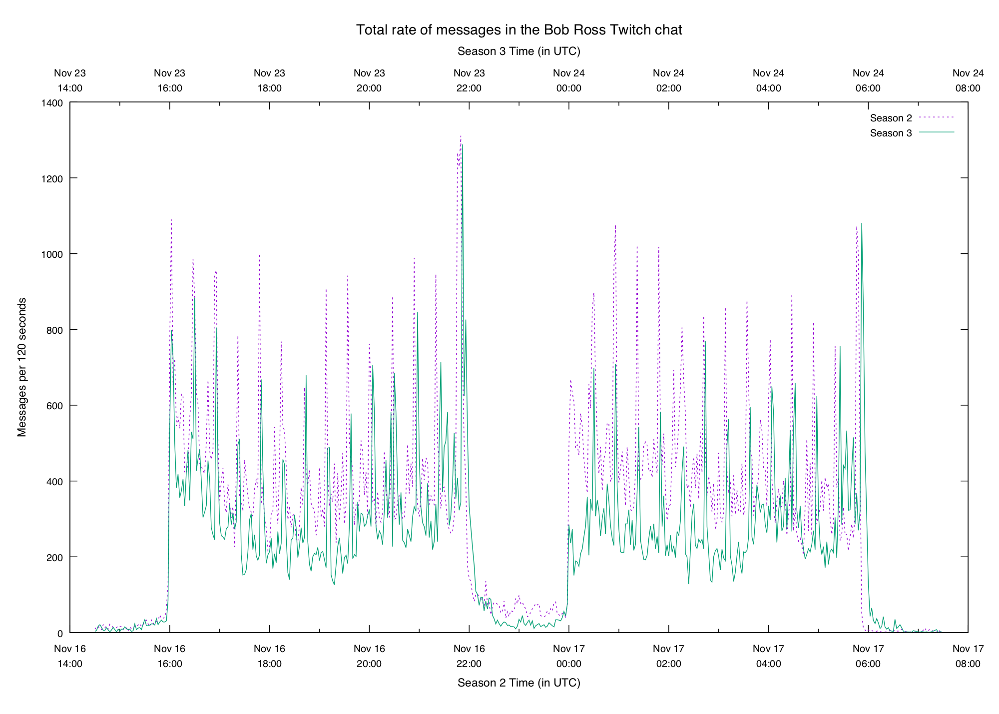
Note the separate x axes to line up the start and end times of the logs. Also two-minute buckets were used to make things a bit cleaner to look at on this crowded graph (see the y axis label).
Seems like this was a bit quieter than last week. It's encouraging that the basic structure looks the same — this hints that there are some patterns waiting to be discovered.
Spiky N-grams
Last week we looked at graphs of various ngrams and saw that some of them show
pretty clear patterns. The end of each episode brings a flood of gg, and when
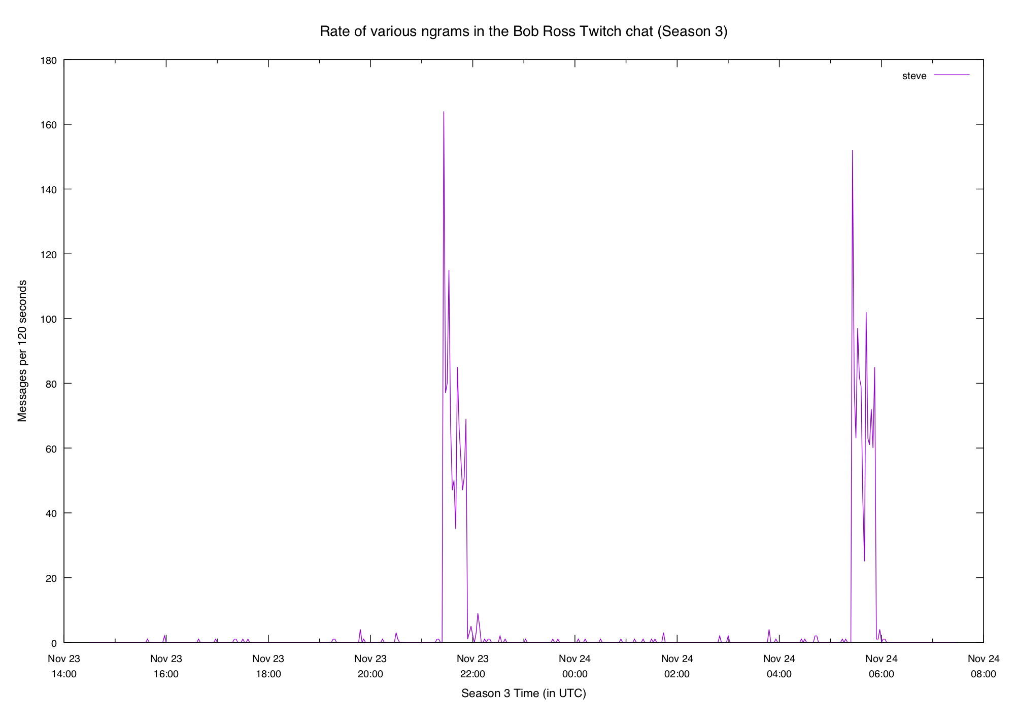
Bob's son Steve comes on the show we get a big spike in steve:
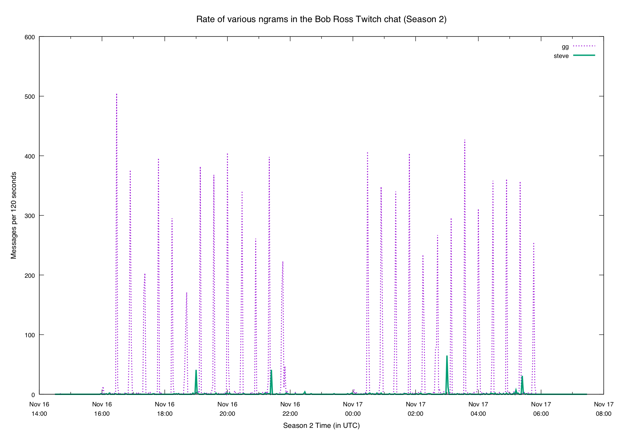
It's reasonable to expect the same behavior this week. What did we get?
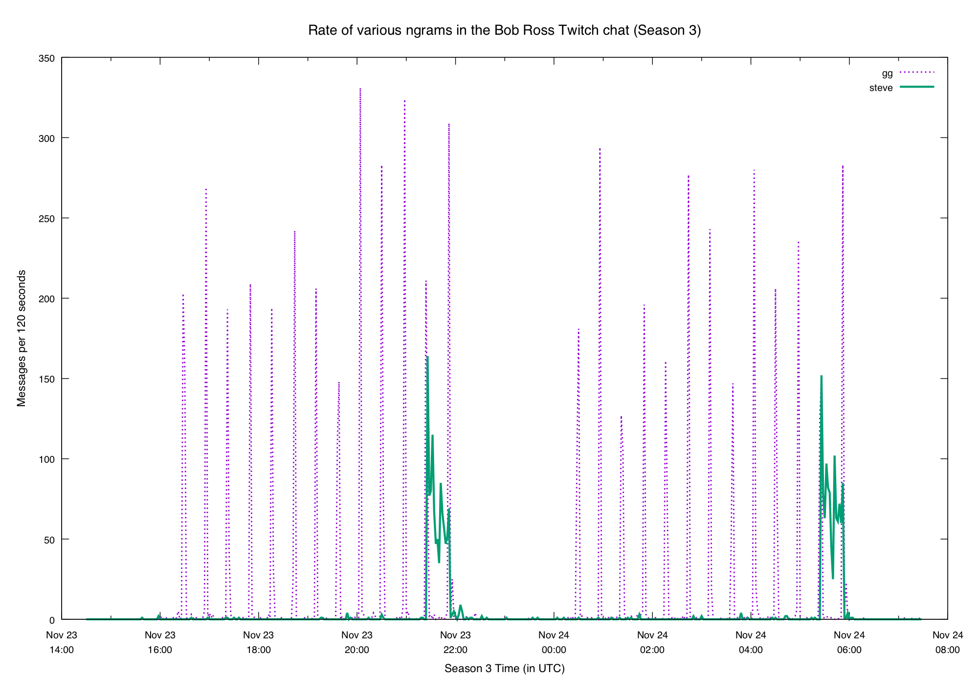
Looks pretty similar! In fact the steve plot is even more obvious this week.
And in both cases the second streaming of the season repeats the pattern seen
in the first.
Each week between the two seasons the channel "hosts" another painter. This just means that it "pipes through" another streamer's channel so people don't get bored.
This week whoever is in charge of picking the guest stream did a shitty job. After the first showing ended viewers were assaulted with the most loud, obnoxious manchild on the planet.
The chat was not pleased:
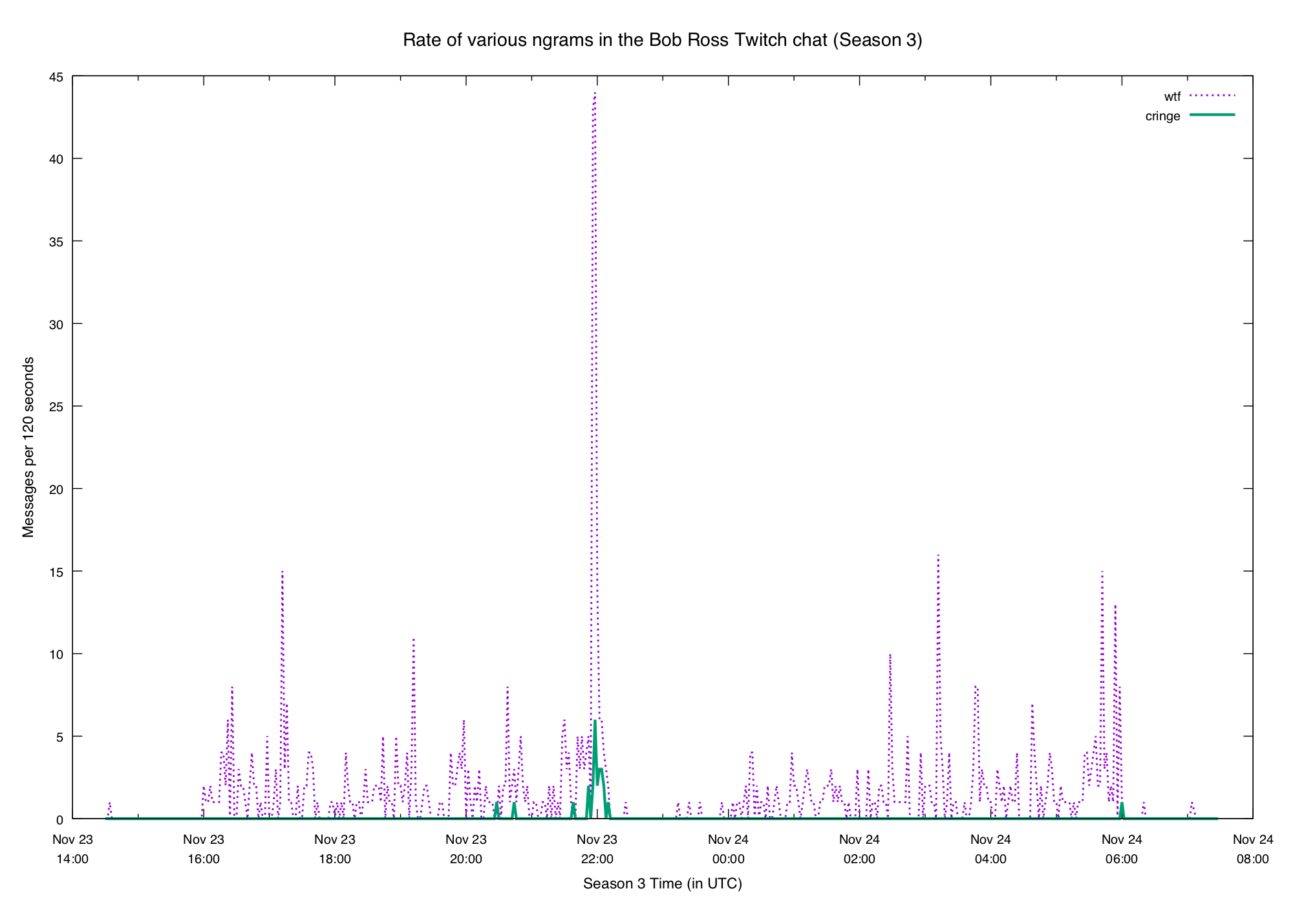
Thankfully whoever manages Bob's channel mercy-killed the hosting after 10 minutes or so, and we enjoyed the blissful silence.
So we've seen that the rate of certain n-grams have clear patterns. If we're interested in a particular n-gram that's great — we can graph it and take a look. But what if we want to find interesting n-grams to look at, without having to watch the whole marathon (or comb through the logs)?
Percentiles
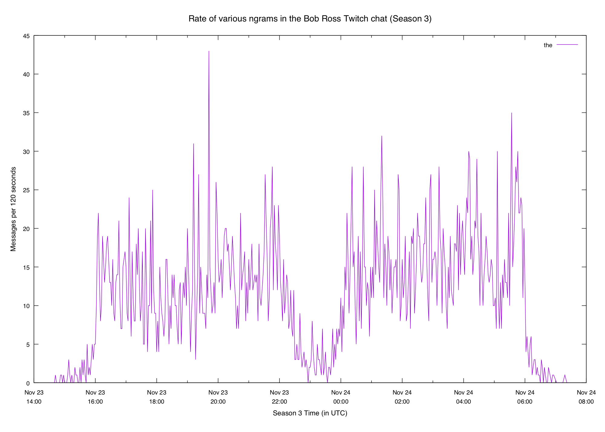
Percentiles are a really useful measurement in a lot of fields, so let's take a look at them here. We'll start with a relatively common n-gram like "the":

Here we've got a pretty smooth gradation from the lower percentiles up to the
higher ones. Note that these are rates of the per minute, so the value 11
at 50 means that half of all 2-minute bins recorded had eleven or fewer
instances of the. This seems low for English text, but a lot of the messages
in the Bob Ross chat are one or two-word slang — full sentences are rare.
If we go back to the normal n-gram plot of the we can see that it's not a very
"spiky" word:
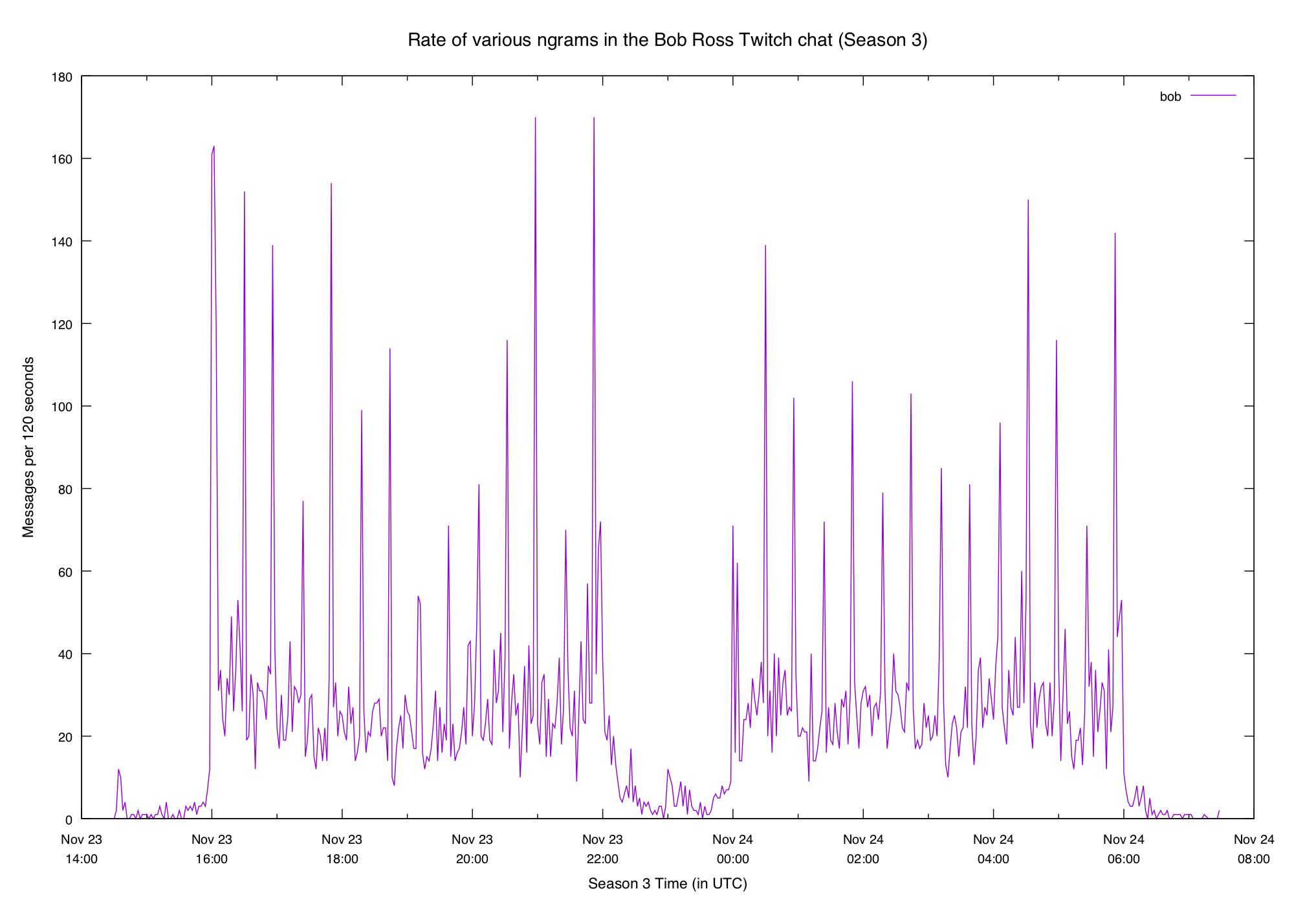
Let's look at another common word, bob:
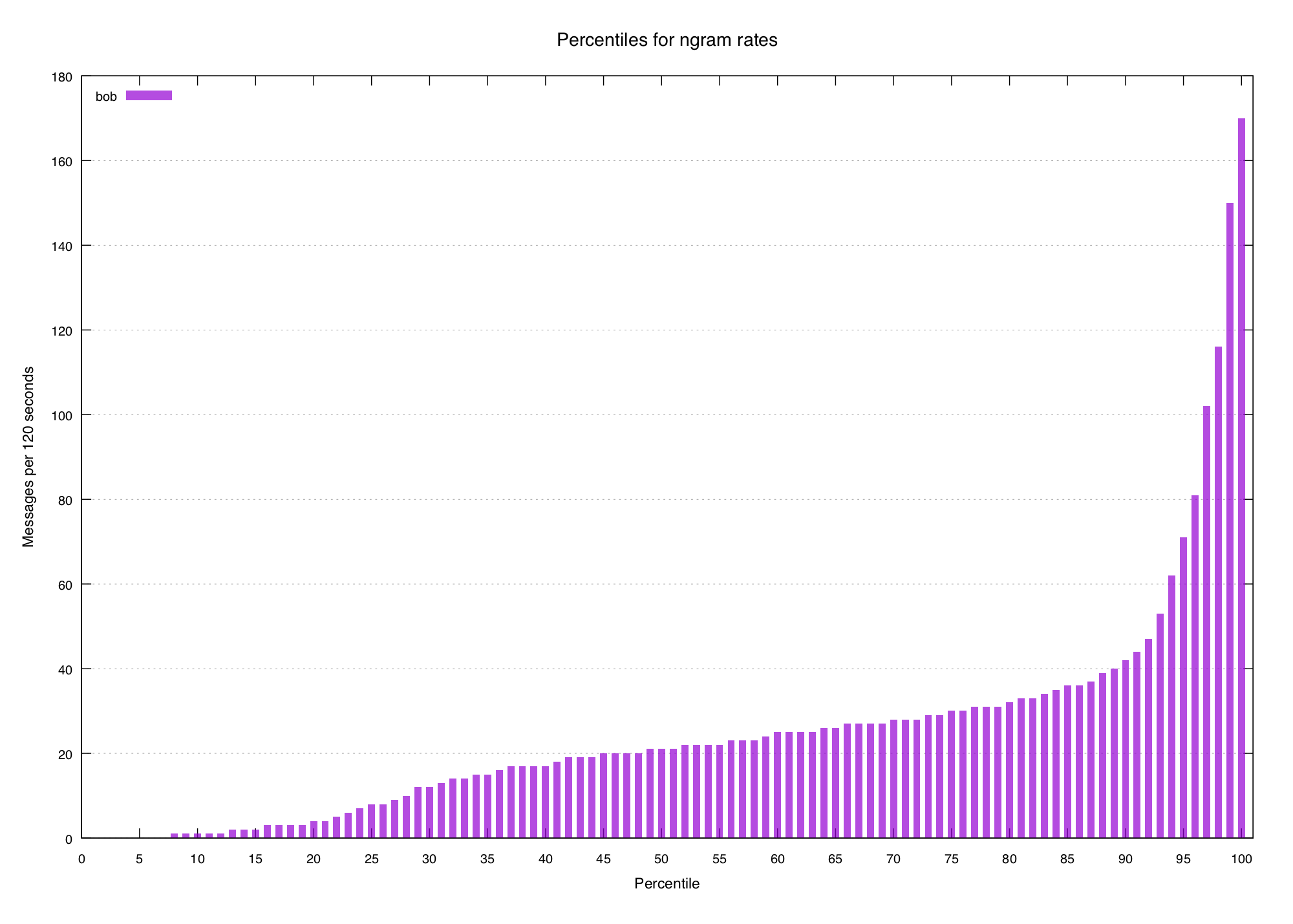
Pretty smooth, though it's a little bit steeper at the end (probably because of
the deluge of hi bob when an episode starts). N-gram plot for comparison:
What about an n-gram we know represents a mostly-unique event, like steve?
We would expect the graph of percentiles to look steeper, because the lower and
middle percentiles would be very low and the highest few would skyrocket.

We've tentatively identified another pattern in the data, but how can it help us find new interesting terms?
Spikiness Scores
If we look at the percentiles for a few known-spiky terms we can see a pattern:
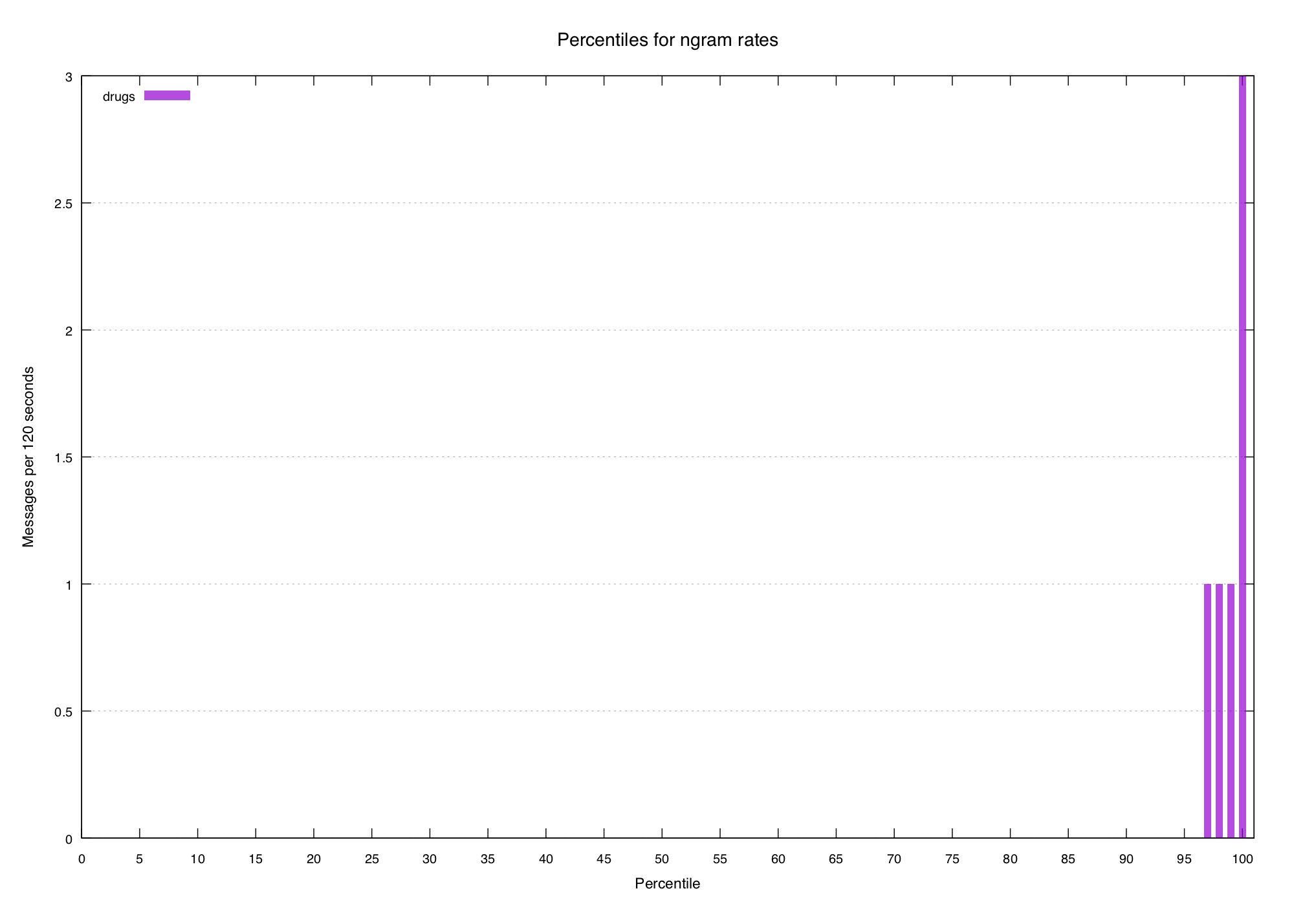
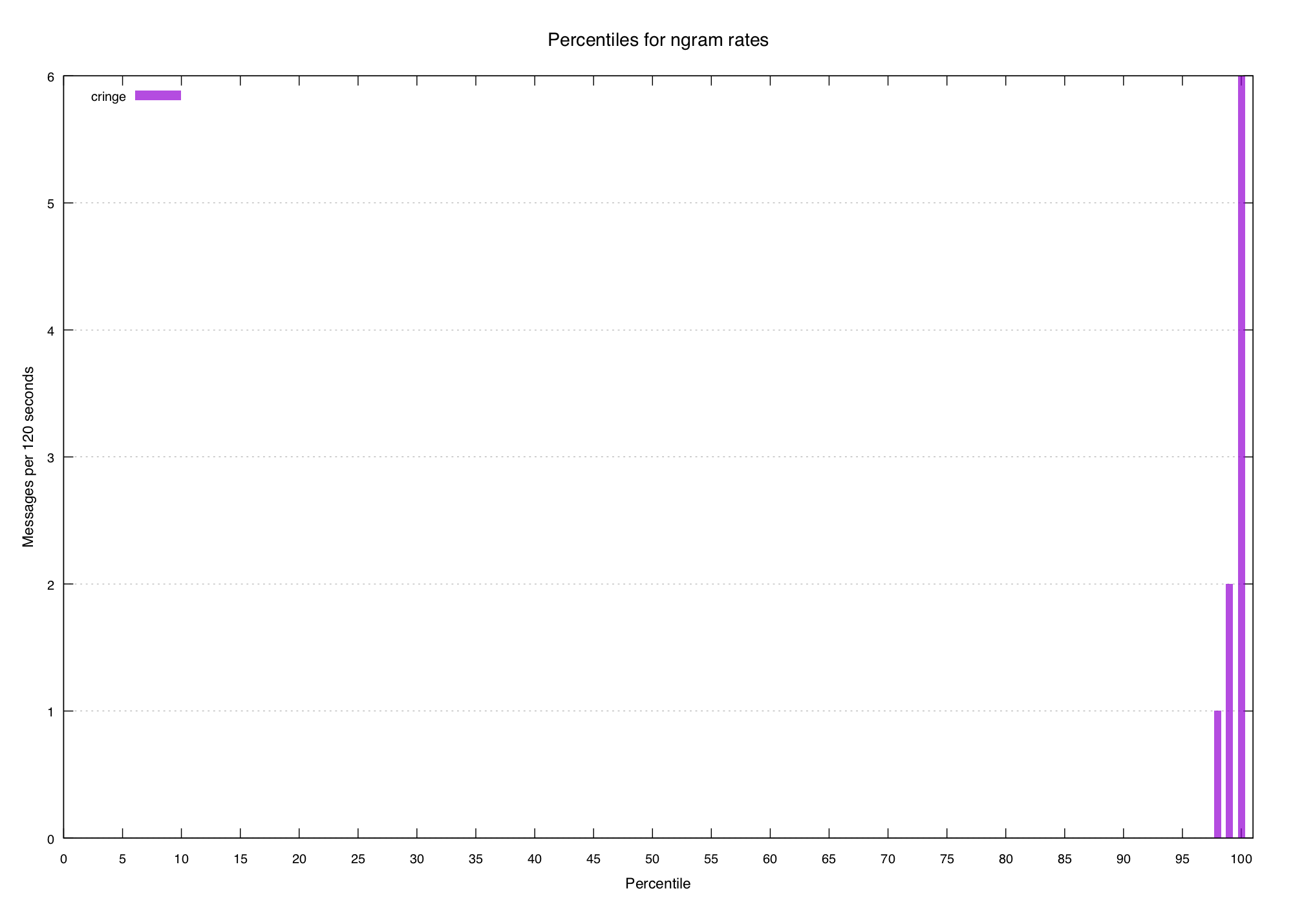
The top percentile or two have some volume, but it quickly drops away to nothingness within five or ten percent. So let's try to define a really basic "spikiness score" that we can work out for all n-grams:
We'll start by saying that the spikiness score of a word is the value of the 100th percentile for that word, divided by the 95th percentile (plus a small smoothing factor to avoid division by zero). Let's try some words:
the     1.78
bob     2.39
steve   4.67
drugs  30.00
cringe 60.00
This doesn't look too terrible. The words we consider spiky are all scored
higher than the non-spiky ones, but it's not quite there yet. steve is rated
pretty low even though we consider it to be spiky.
When we made our initial formula we arbitrarily picked the 100th and 95th percentiles out of thin air. What if we choose the 99th and 90th instead?
bob 3.56
the 1.42
steve 77.27
cringe 20.00
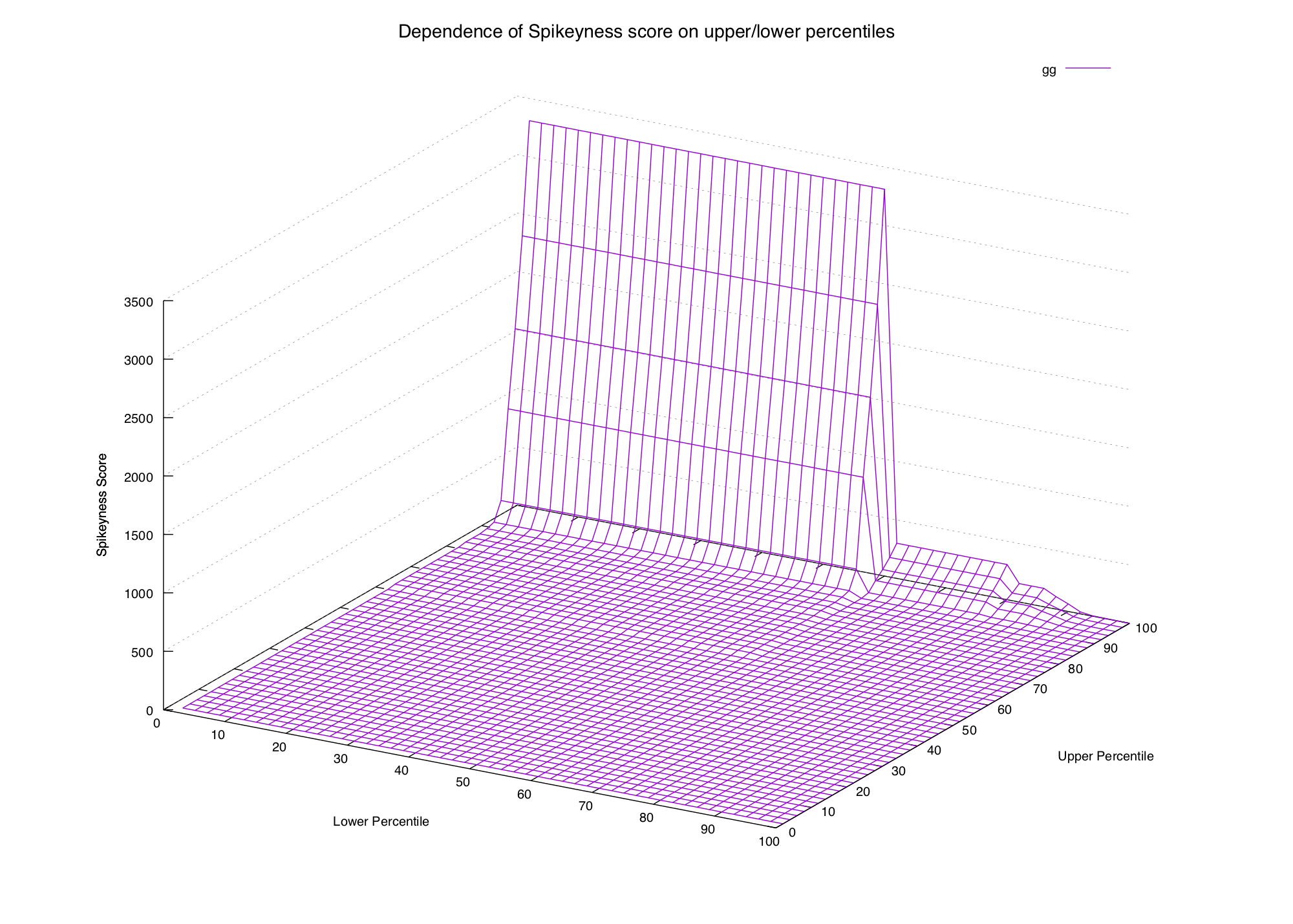
drugs 10.00This has changed the scores quite a bit, and now they're more like what we want. But again, we just picked the two percentiles out of thin air. It would be nice if we could get a feel for how the choice of percentiles affects our spikiness scores. Once again, let's turn to gnuplot. We'll generalize our function:
And graph it for all the combinations of percentiles for a couple of words we know:
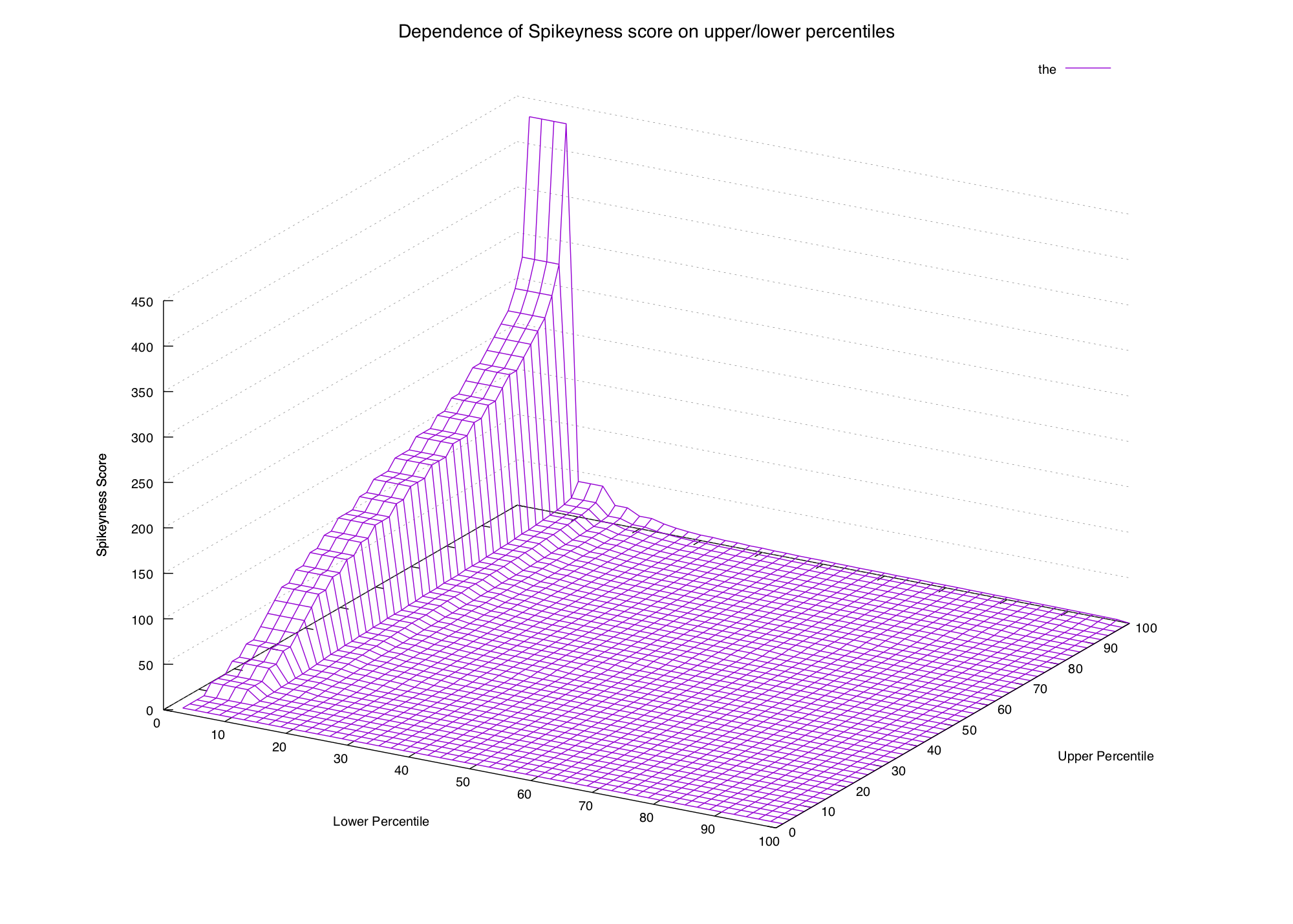

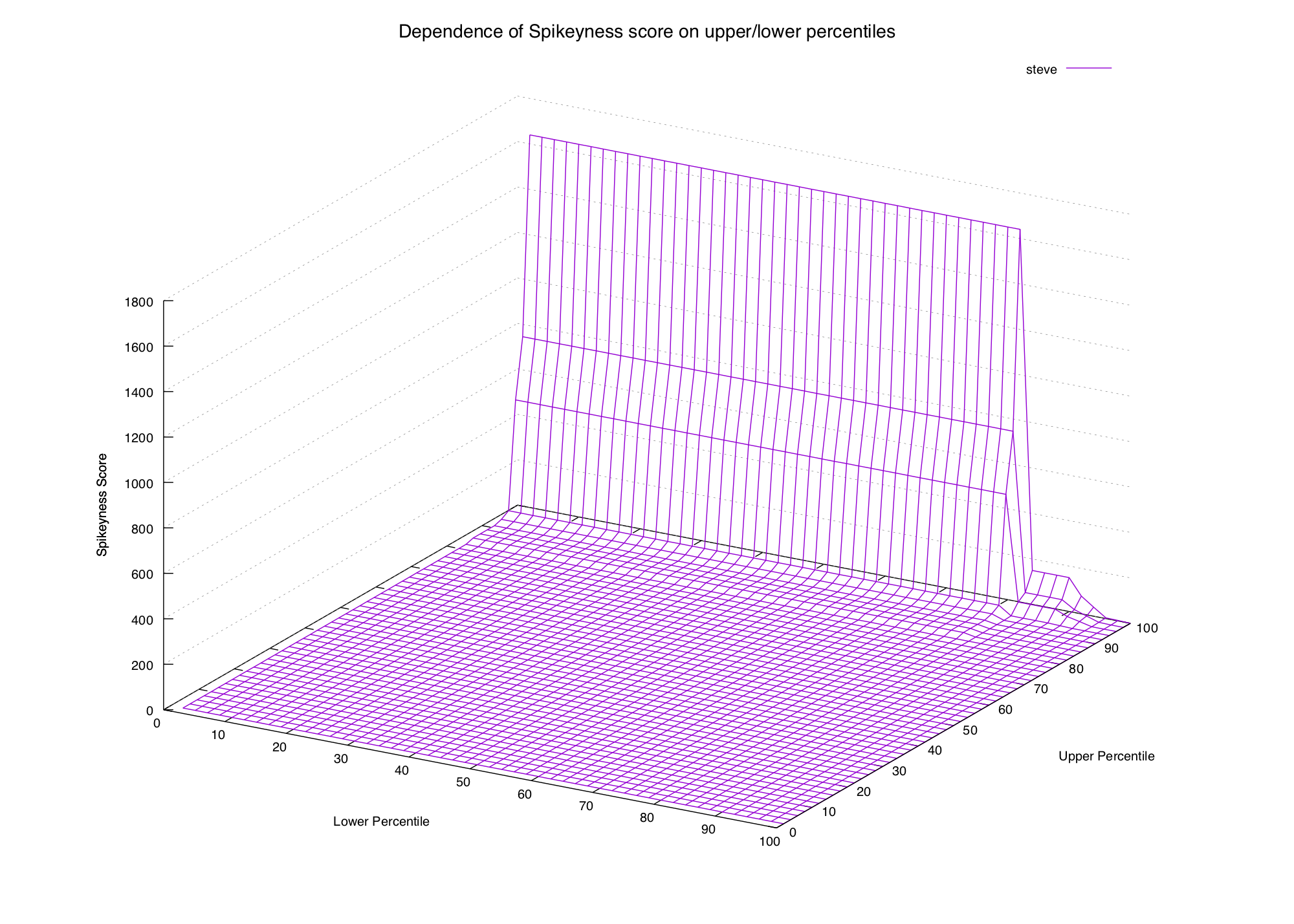
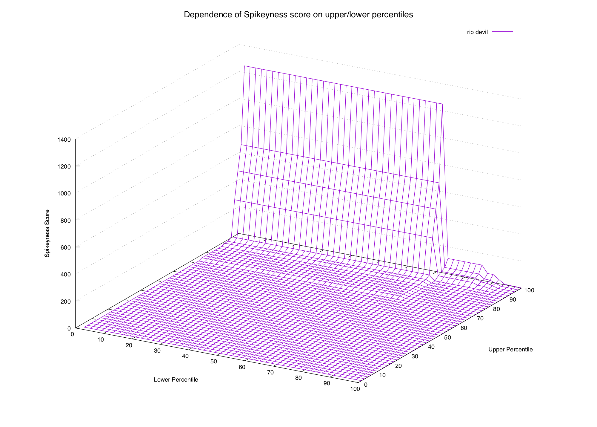
These graphs are approaching the point of being impossible to read, but we can definitely see a pattern. In the first two graphs (common words) the only way to get a high spikiness score is to choose our formula's lower percentile to be really low (15th percentile or lower).
In the second two graphs (spiky words) we can see that the score is high when the upper percentile is 99th or 100th, and the lower percentile is beneath the 90th (or thereabouts).
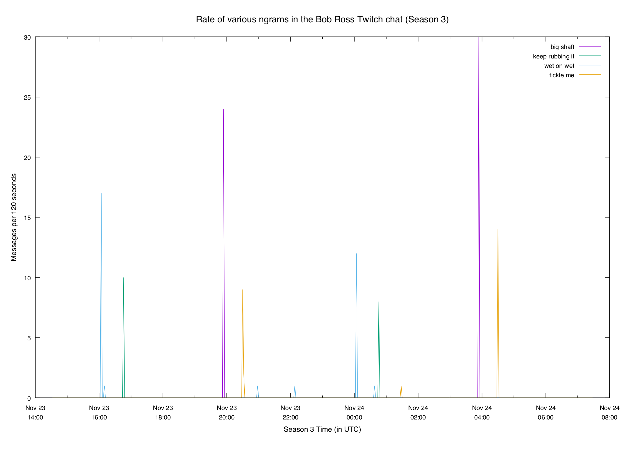
Now that we have a hypothesis let's try a couple more plots to see if it still holds:
gg does come in spikes, but it happens so often that we need to select
a smaller lower percentile if we want it to be considered spiky. Whether we
want to depends on what we're looking for — if we want rare events then we
probably want to exclude it.
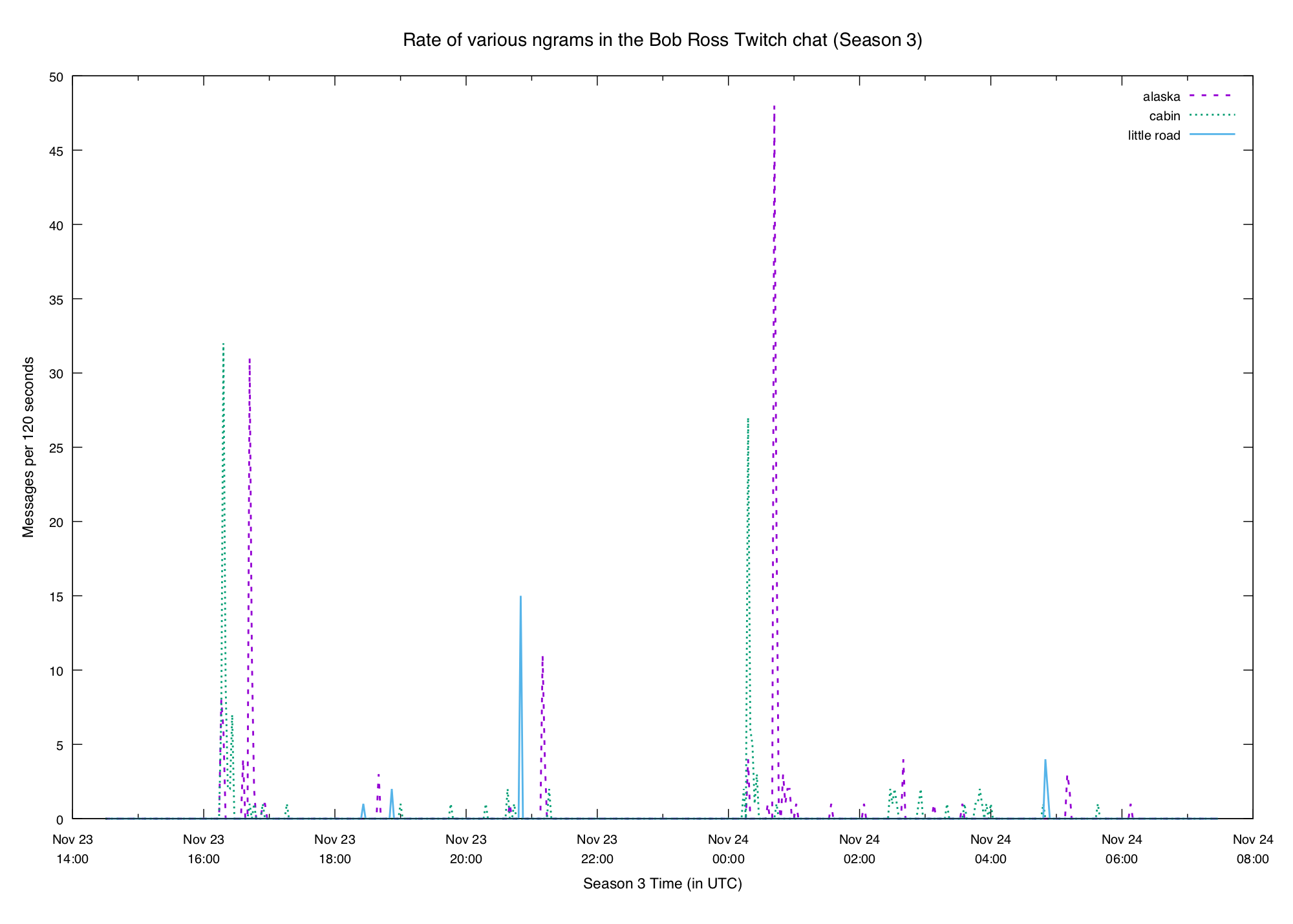
ruined get spammed so much that it's certainly not rare, and isn't even
particularly spiky in any way:


So it looks like we're at least on a reasonable track here. Let's settle the 100th and 90th for now and see where they lead.
There's one other addition to our spikiness formula we should make before moving on: if the 100th percentile of a term is small (e.g. less than 5) then while it might technically be spiky, we probably don't care about it. So we'll just drop those on the floor and not really worry about them.
Results
Now that we've got a way to measure a term's spikiness, we can calculate it for all n-grams and sort to find some interesting ones. Let's try it with bigrams:
mouth__noises 680.00
(__mouth 520.00
soft__music 480.00
elevator__music 480.00
noises__) 470.00
believe__biblethump 460.00
cool__elevator 450.00
soft__rock 390.00
smooth__soft 390.00
smooth__jazz 380.00
relaxing__guitar 360.00
guitar__music 360.00
son__of 330.00
music__) 330.00
(__soft 330.00
a__gun 320.00
(__relaxing 320.00
big__shaft 300.00
super__steve 290.00
jazz__music 280.00
crazy__day 280.00
zoop__zoop 270.00
the__heck 270.00
(__smooth 260.00
flat__trees 240.00
steve__! 220.00
hi__steve 220.00
...
We can get similar results for unigrams, trigrams, etc. Let's graph a couple of these highly-spiky terms. Twitch chat definitely loves innuendo:
Something new this week was the addition of captions, which sometimes included
things like (soft music) and (mouth noises). The chat liked to poke fun at
those:

We can also see some particular elements of paintings:
The lists aren't perfect. They contain a lot of redundant stuff (e.g. (soft
music) produces 3 separate bigrams that are all equally spiky), and there's
a bunch of stuff we don't care about as much. But if you're looking to find
some interesting terms they can at least give you a starting point.
Join the Fun
I'm posting this right as the Season 4 marathon is going live on the Bob Ross Twitch channel If you've got some time feel free to pull up your comfy computer chair and join a few thousand other people for a relaxing evening with Bob!